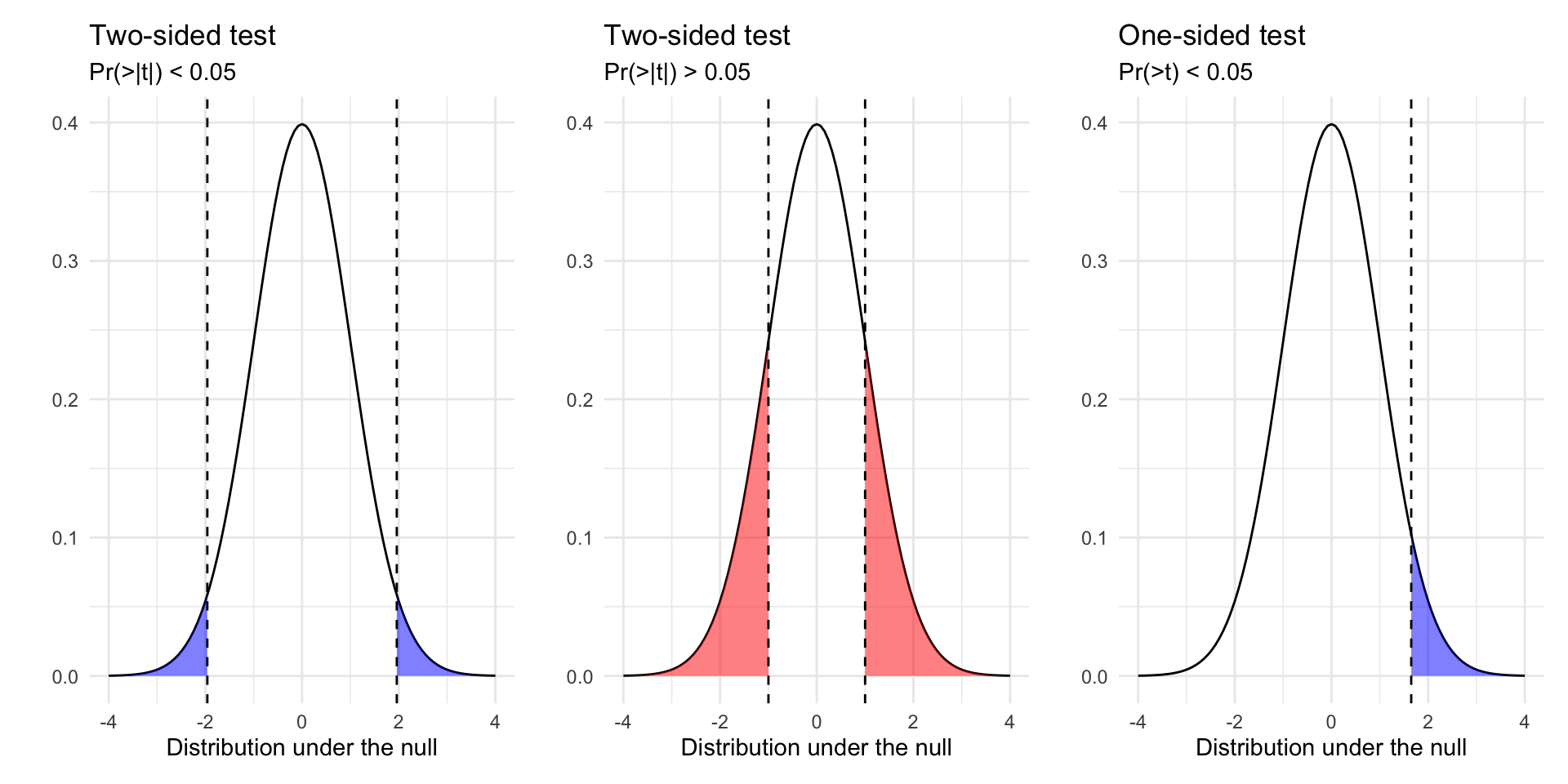
# Load Data
load(url("https://pols2580.paultesta.org/files/data/nes24.rda"))
# ---- Population ----
# Population average
mu_age <- mean(df$age, na.rm=T)
# Population standard deviation
sd_age <- sd(df$age, na.rm = T)
# ---- Function to Take Repeated Samples From Data ----
sample_data_fn <- function(
dat=df, var=age, samps=1000, sample_size=10,
resample = F){
if(resample == F){
df <- tibble(
sim = 1:samps,
distribution = "Sampling",
size = sample_size,
sample_from = "Population",
pop_mean = dat %>% pull(!!enquo(var)) %>% mean(., na.rm=T),
pop_sd = dat %>% pull(!!enquo(var)) %>% sd(., na.rm=T),
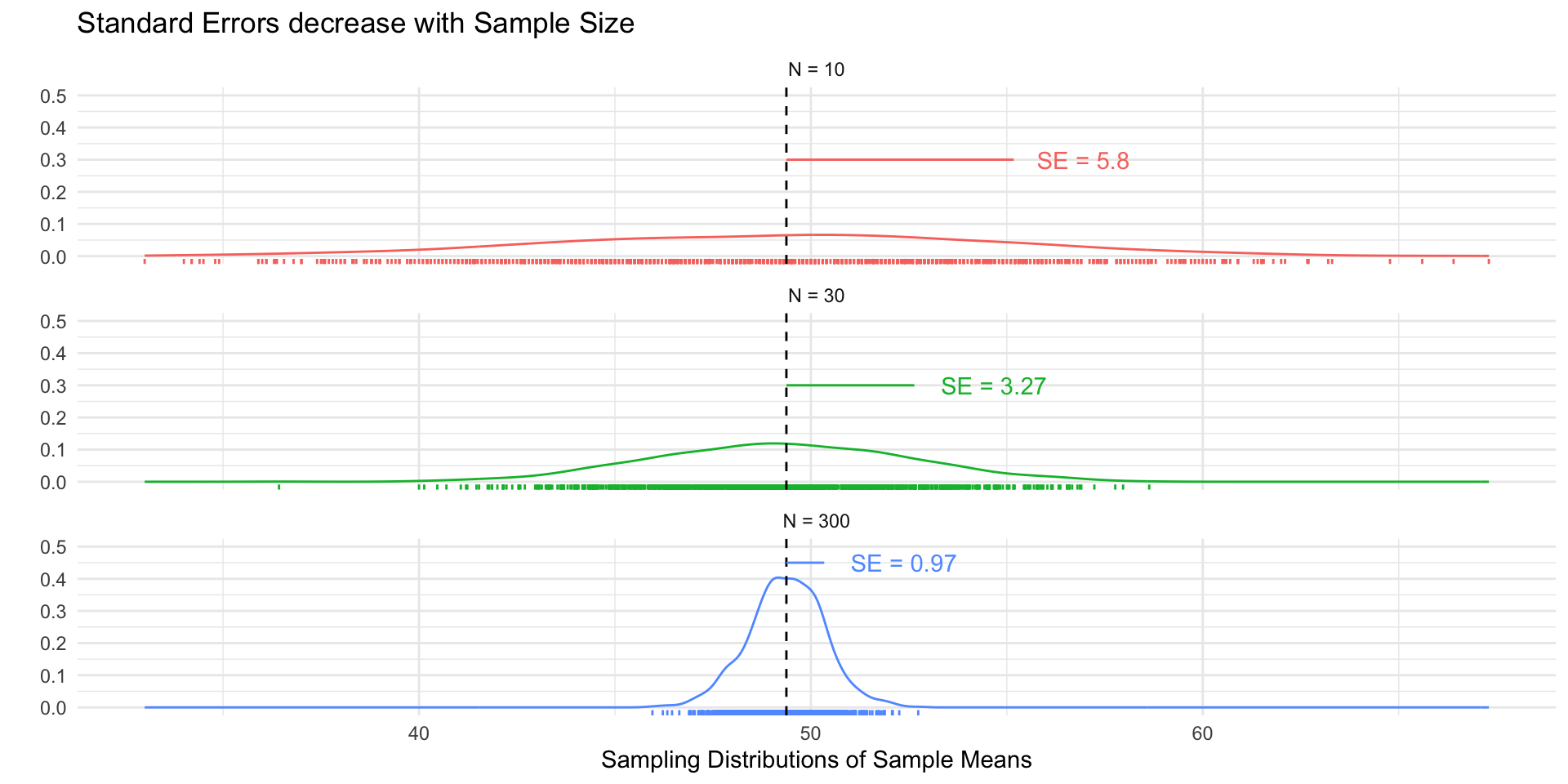
se_asymp = pop_sd / sqrt(size),
ll_asymp = pop_mean - 1.96*se_asymp,
ul_asymp = pop_mean + 1.96*se_asymp,
) %>%
mutate(
sample = purrr::map(sim, ~ slice_sample(dat %>% select(!!enquo(var)), n = sample_size, replace = F)),
sample_mean = purrr::map_dbl(sample, \(x) x %>% pull(!!enquo(var)) %>% mean(.,na.rm=T)),
ll = sample_mean - 1.96*sd(sample_mean),
ul = sample_mean + 1.96*sd(sample_mean)
)
}
if(resample == T){
df <- tibble(
sim = 1:samps,
distribution = "Resampling",
size = sample_size,
sample_from = "Sample",
pop_mean = dat %>% pull(!!enquo(var)) %>% mean(., na.rm=T),
pop_sd = dat %>% pull(!!enquo(var)) %>% sd(., na.rm=T),
se_asymp = pop_sd / sqrt(size),
ll_asymp = pop_mean - 1.96*se_asymp,
ul_asymp = pop_mean + 1.96*se_asymp,
) %>%
mutate(
sample = purrr::map(sim, ~ slice_sample(dat %>% select(!!enquo(var)), n = sample_size, replace = T)),
sample_mean = purrr::map_dbl(sample, \(x) x %>% pull(!!enquo(var)) %>% mean(.,na.rm=T))
)
}
return(df)
}
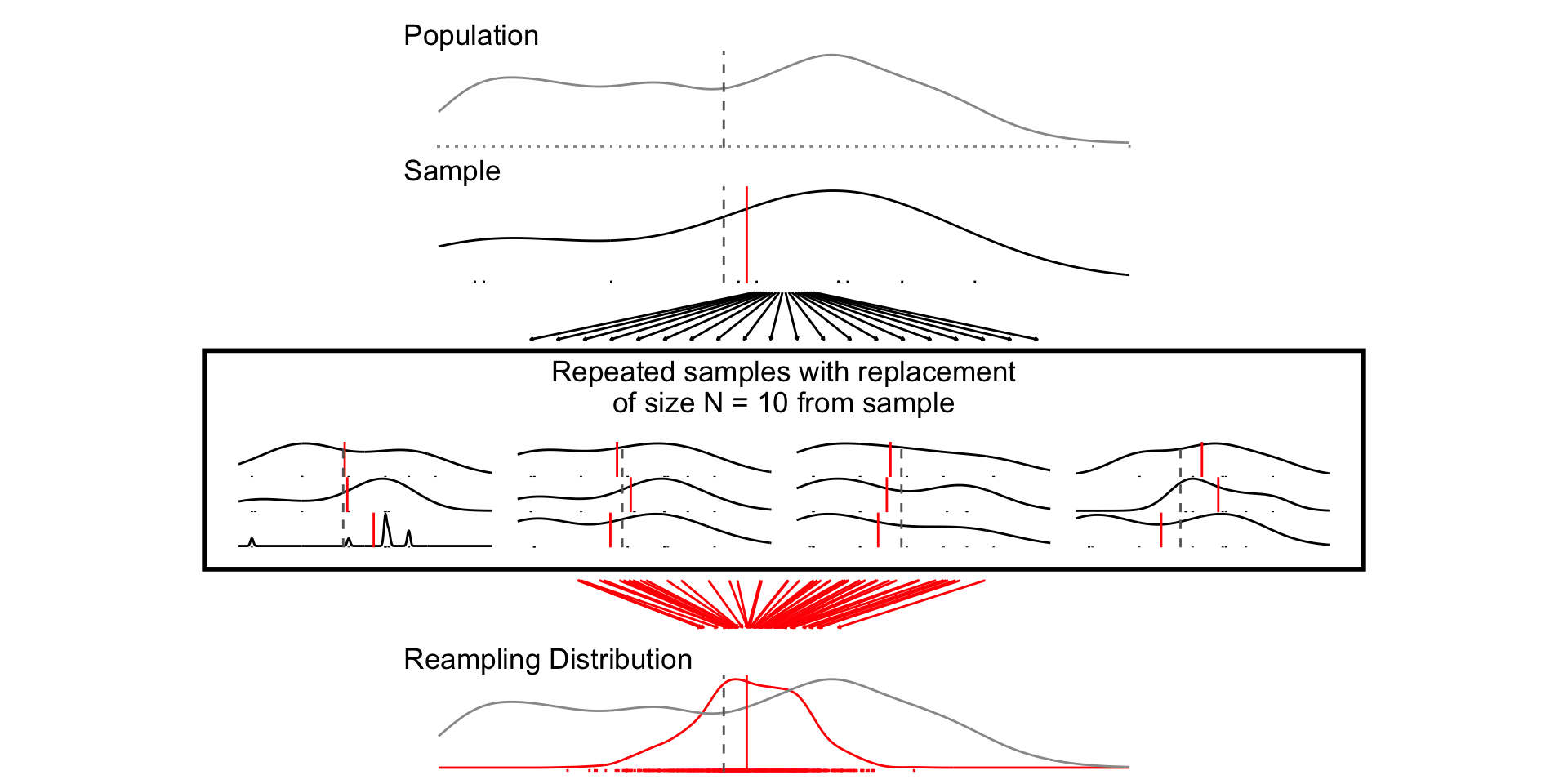
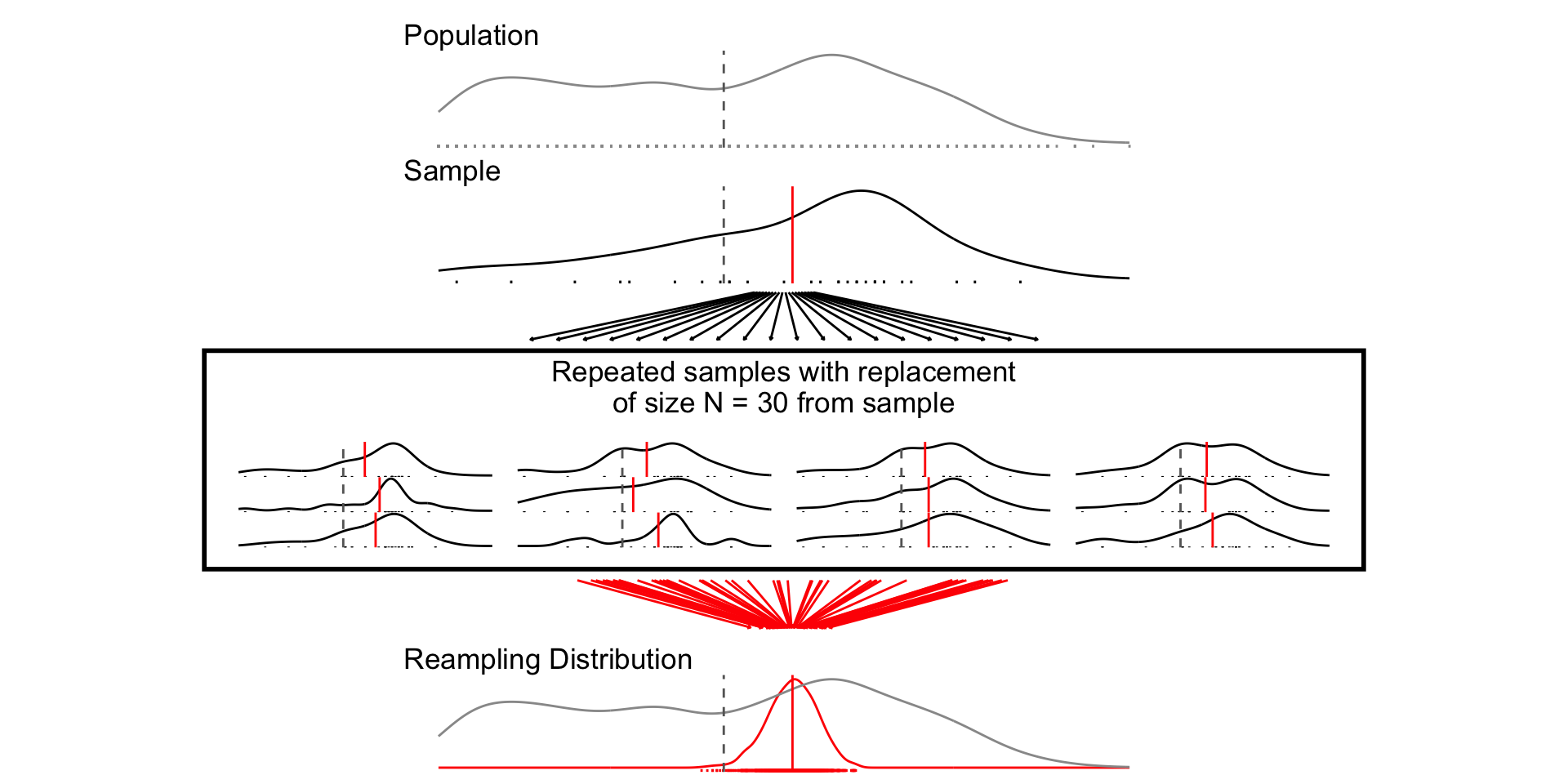
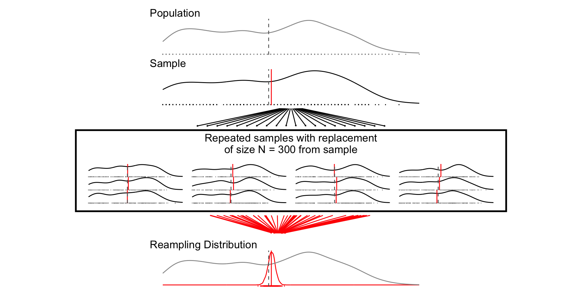
# ---- Plot Single Distribution -----
plot_distribution <- function(the_pop,the_samp, the_var, ...){
mu_pop <- the_pop %>% pull(!!enquo(the_var)) %>% mean(., na.rm=T)
mu_samp <- the_samp %>% pull(!!enquo(the_var)) %>% mean(., na.rm=T)
ll <- the_pop %>% pull(!!enquo(the_var)) %>% as.numeric() %>% min(., na.rm=T)
ul <- the_pop %>% pull(!!enquo(the_var)) %>% as.numeric() %>% max(., na.rm=T)
p<- the_samp %>%
ggplot(aes(!!enquo(the_var)))+
geom_density()+
geom_rug()+
theme_void()+
geom_vline(xintercept = mu_samp, col = "red")+
geom_vline(xintercept = mu_pop, col = "grey40",linetype = "dashed")+
xlim(ll,ul)
return(p)
}
# ---- Plot multiple distributions ----
plot_samples <- function(pop, x, variable,n_rows = 4, ...){
sample_plots <- x$sample[1:(4*n_rows)] %>%
purrr::map( \(x) plot_distribution(the_pop=pop, the_samp = x,
the_var = !!enquo(variable)))
p <- wrap_elements(wrap_plots(sample_plots[1:(4*n_rows)], ncol=4))
return(p)
}
# ---- Plot Combined Figure ----
plot_figure_fn <- function(
d=df,
v=age,
sim=1000,
size=10,
rows = 4){
# Population average
mu <- d %>% pull(!!enquo(v)) %>% mean(., na.rm=T)
sd <- d %>% pull(!!enquo(v)) %>% sd(., na.rm=T)
se <- sd/sqrt(size)
# Range
ll <- d %>% pull(!!enquo(v)) %>% as.numeric() %>% min(., na.rm=T)
ul <- d %>% pull(!!enquo(v)) %>% as.numeric() %>% max(., na.rm=T)
# Population standard deviation
# Sample data
samp_df <- sample_data_fn(dat=d, var = !!enquo(v), samps = sim, sample_size = size)
# Plot Population
p_pop <- d %>%
ggplot(aes(!!enquo(v)))+
geom_density(col ="grey60")+
geom_rug(col = "grey60", )+
geom_vline(xintercept = mu, col="grey40", linetype="dashed")+
theme_void()+
labs(title ="Population")+
xlim(ll,ul)+
theme(plot.title = element_text(hjust = 0))
p_samps <- plot_samples(pop=d, x= samp_df,variable = !!enquo(v),
n_rows = rows)
p_samps <- p_samps +
ggtitle(paste("Repeated samples of size N =",size,"from the population"))+
theme(plot.title = element_text(hjust = 0.5),
plot.background = element_rect(
fill = NA, colour = 'black', linewidth = 2)
)
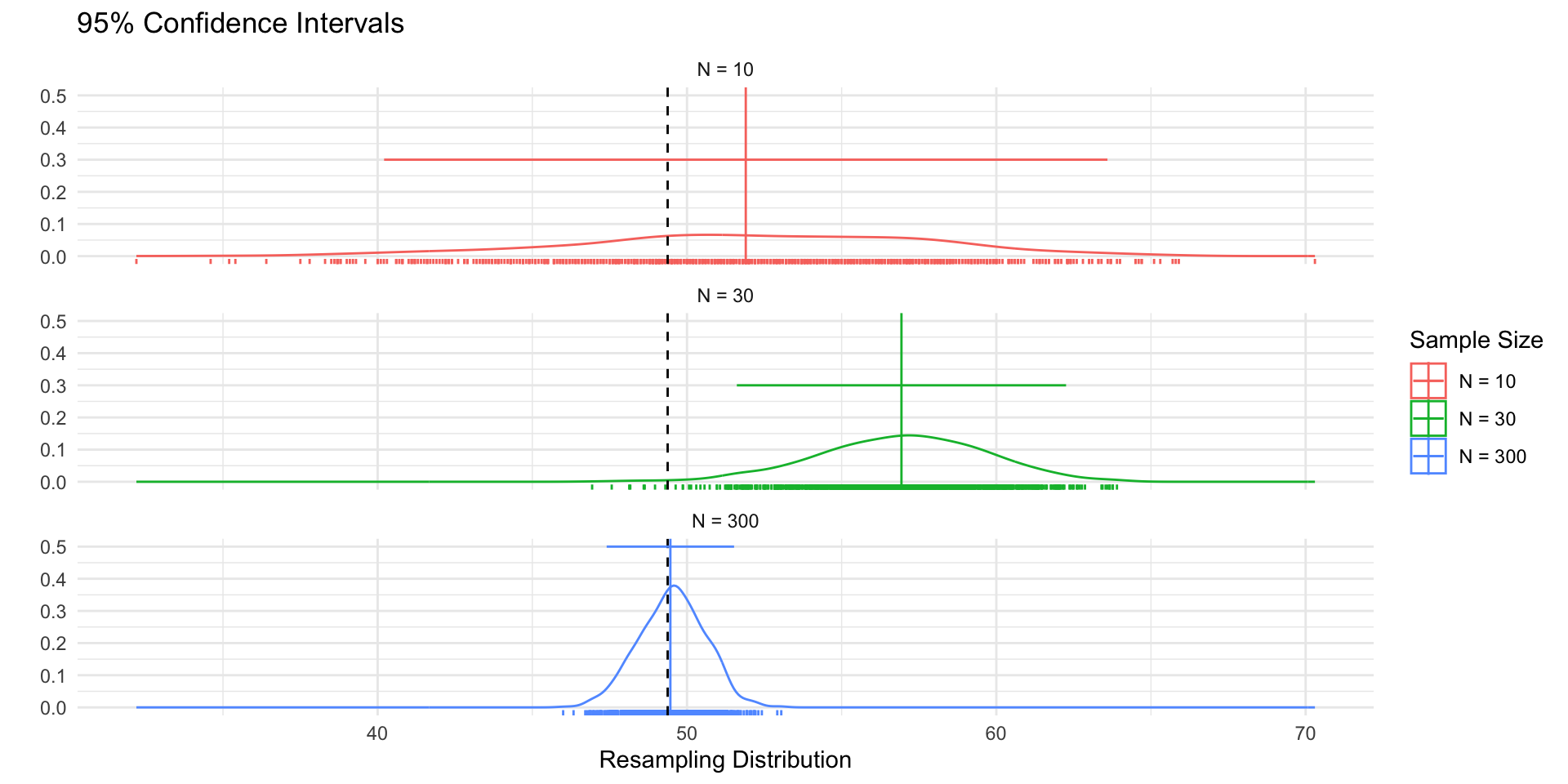
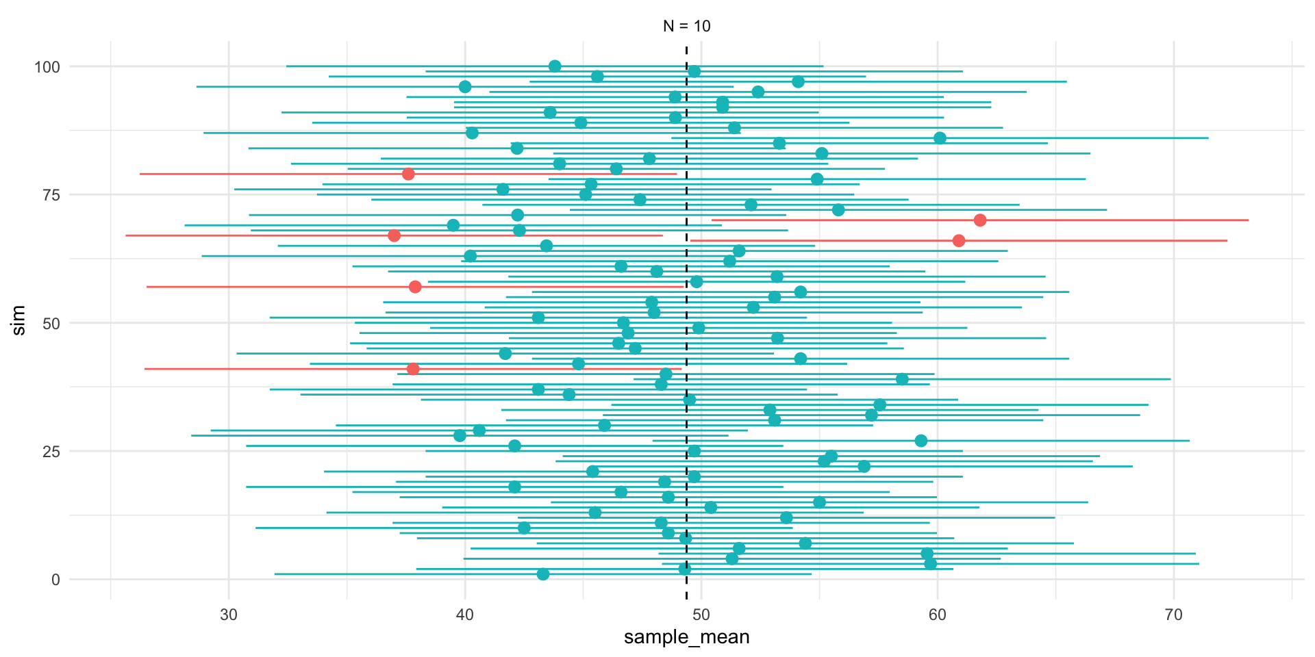
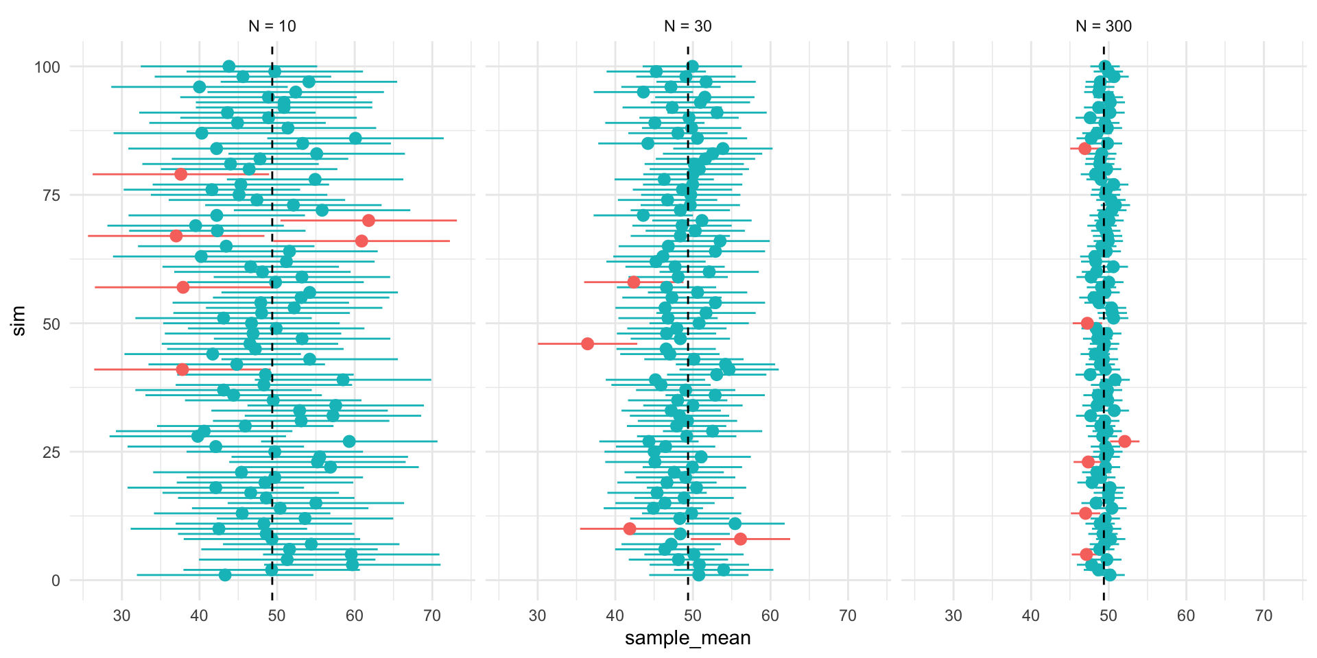
p_dist <- samp_df %>%
ggplot(aes(sample_mean))+
geom_density(col="red",aes(y= after_stat(ndensity)))+
geom_rug(col="red")+
geom_density(data = df, aes(!!enquo(v), y= after_stat(ndensity)),
col="grey60")+
geom_vline(xintercept = mu, col="grey40", linetype="dashed")+
xlim(ll,ul)+
theme_void()+
labs(
title = "Sampling Distribution"
)+ theme(plot.title = element_text(hjust = 0))
range_upper_df <- tibble(
x = seq( ((ll+ul)/2 -5), ((ll+ul)/2 +5), length.out = 20),
xend = seq(ll-5, ul+5, length.out = 20),
y = rep(9, 20),
yend = rep(1, 20)
)
p_upper <- range_upper_df %>%
ggplot(aes(x=x, xend = xend, y=y,yend=yend))+
geom_segment(
arrow = arrow(length = unit(0.05, "npc"))
)+
theme_void()+
coord_fixed(ylim=c(0,10),
xlim =c(ll-5,ul+5),clip="off")
# Lower
range_df <- samp_df %>%
summarise(
min = min(sample_mean),
max = max(sample_mean),
mean = mean(sample_mean)
)
plot_df <- tibble(
id = 1:50,
# x = sort(rnorm(50, mu, sd)),
x = sort(runif(50, ll, ul)),
xend = sort(rnorm(50, mu, se)),
y = 9,
yend = 1
)
p_lower <- plot_df %>%
ggplot(aes(x,y, group =id))+
geom_segment(aes(xend=xend, yend=yend),
col = "red",arrow = arrow(length = unit(0.05, "npc"))
)+
theme_void()+
coord_fixed(ylim=c(0,10),xlim = c(ll,ul),clip="off")
design <-"##AAAA##
##AAAA##
##AAAA##
BBBBBBBB
BBBBBBBB
#CCCCCC#
#CCCCCC#
#CCCCCC#
#CCCCCC#
DDDDDDDD
DDDDDDDD
##EEEE##
##EEEE##
##EEEE##"
fig <- p_pop / p_upper / p_samps / p_lower / p_dist +
plot_layout(design = design)
return(fig)
}
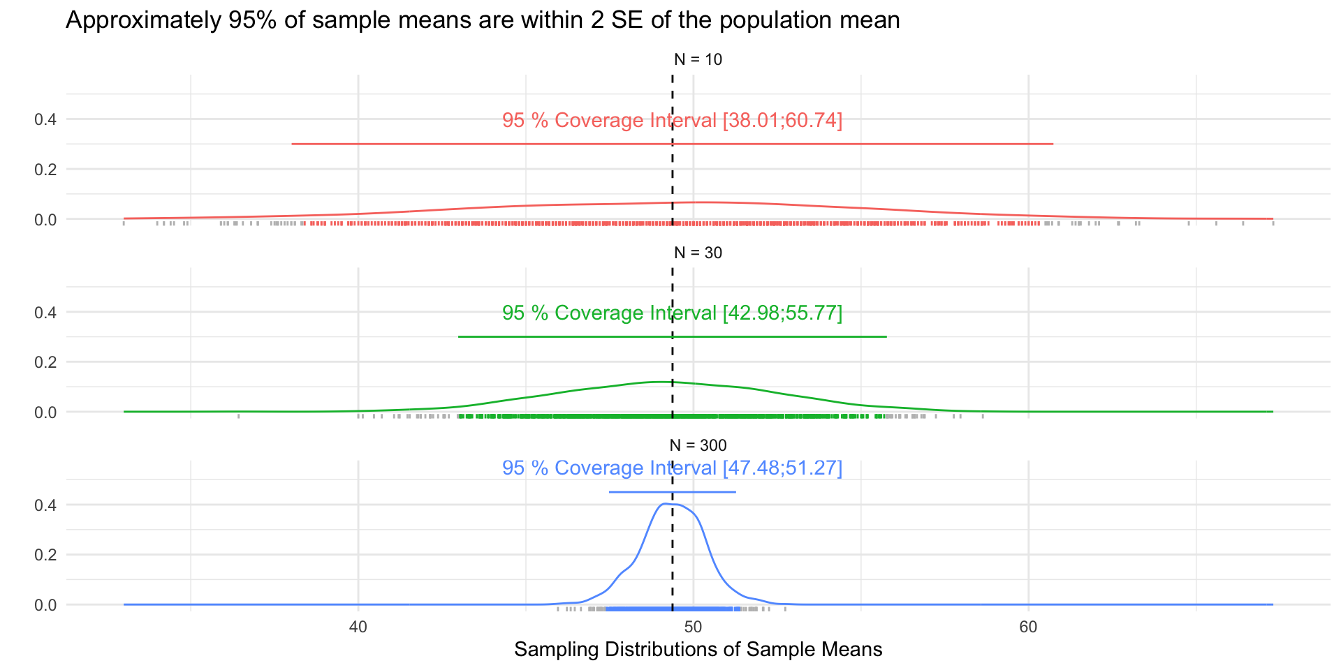
# ---- Samples and Figures Varying Sample Size ----
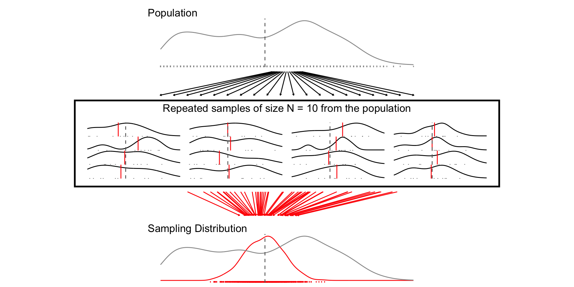
## N = 10
set.seed(1234)
samp_n10 <- sample_data_fn(sample_size = 10, samps = 1000)
set.seed(1234)
fig_n10 <- plot_figure_fn(v=age,size = 10)
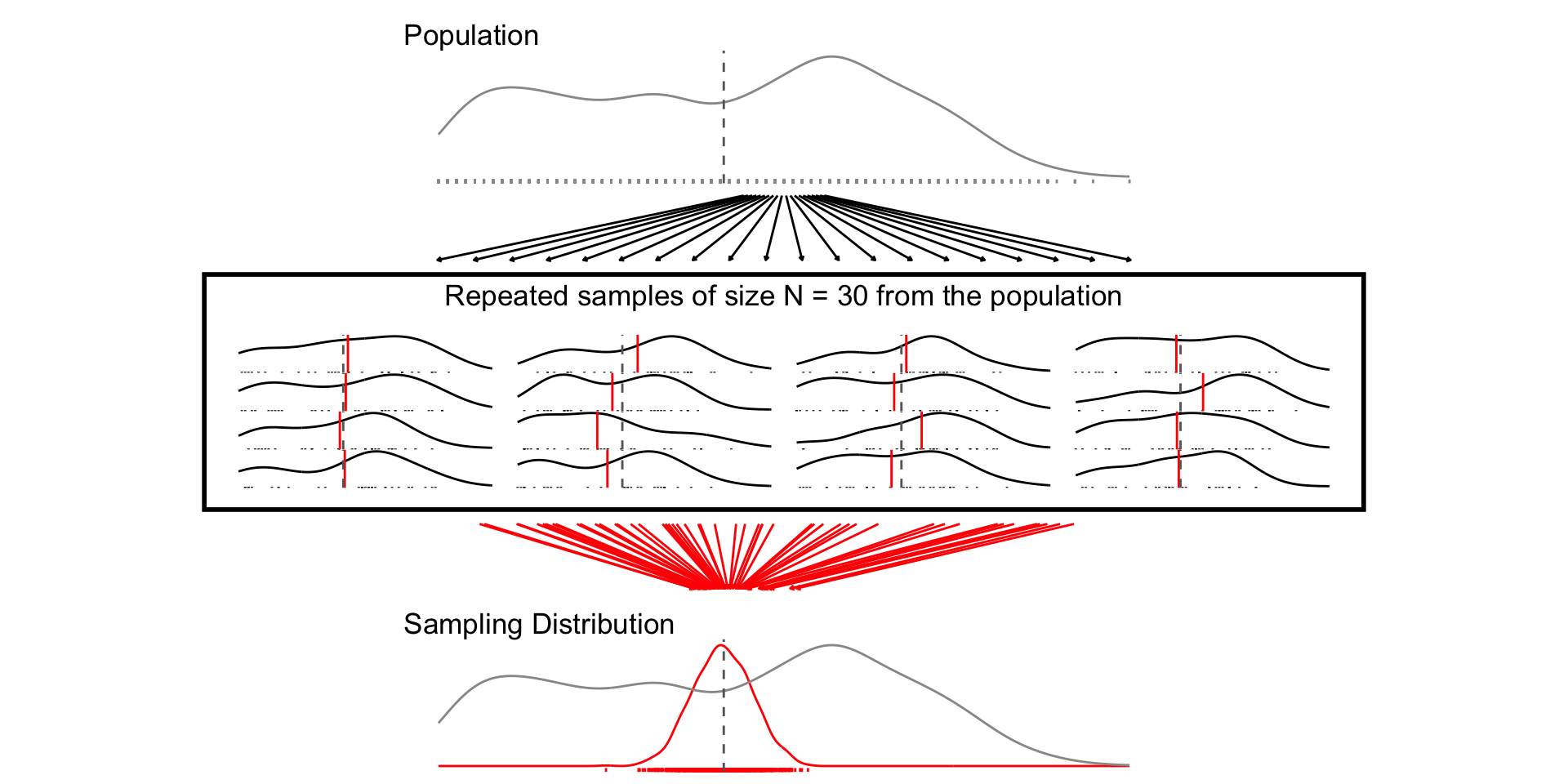
## N = 30
set.seed(1234)
samp_n30 <- sample_data_fn(sample_size = 30, samps = 1000)
set.seed(1234)
fig_n30 <- plot_figure_fn(size = 30,rows=4)
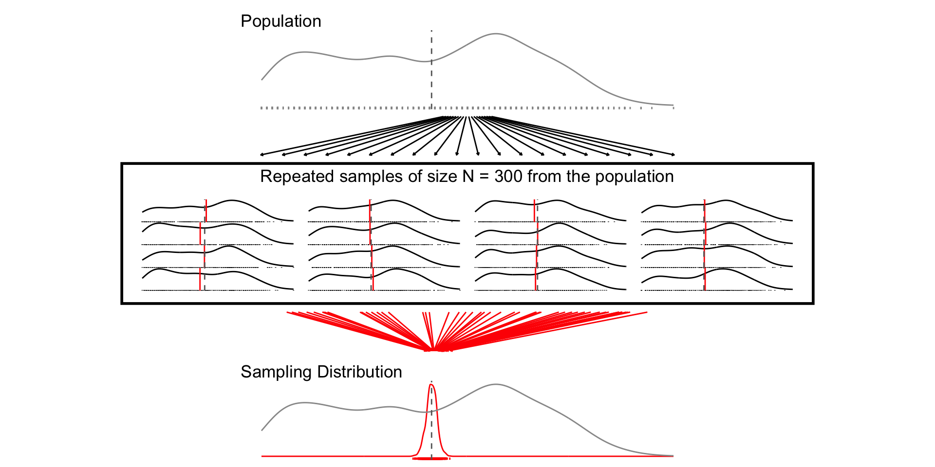
## N = 300
set.seed(1234)
samp_n300 <- sample_data_fn(sample_size = 300, samps = 1000)
set.seed(1234)
fig_n300 <- plot_figure_fn(size = 300)