 [1] "tinytex"    "kableExtra" "tidyverse"  "lubridate"  "forcats"
 [6] "haven"      "labelled"   "ggmap"      "ggrepel"    "ggridges"
[11] "ggthemes"   "ggpubr"     "GGally"     "COVID19"    "maps"
[16] "mapdata" "DT" POLS 2580
Data Visualization
Updated Dec 4, 2025
Announcements
Comments to lab 1 posted here
No Paul next week
No office hours (Thursdays from 1-3 pm) next week


You trying to get the %>%?

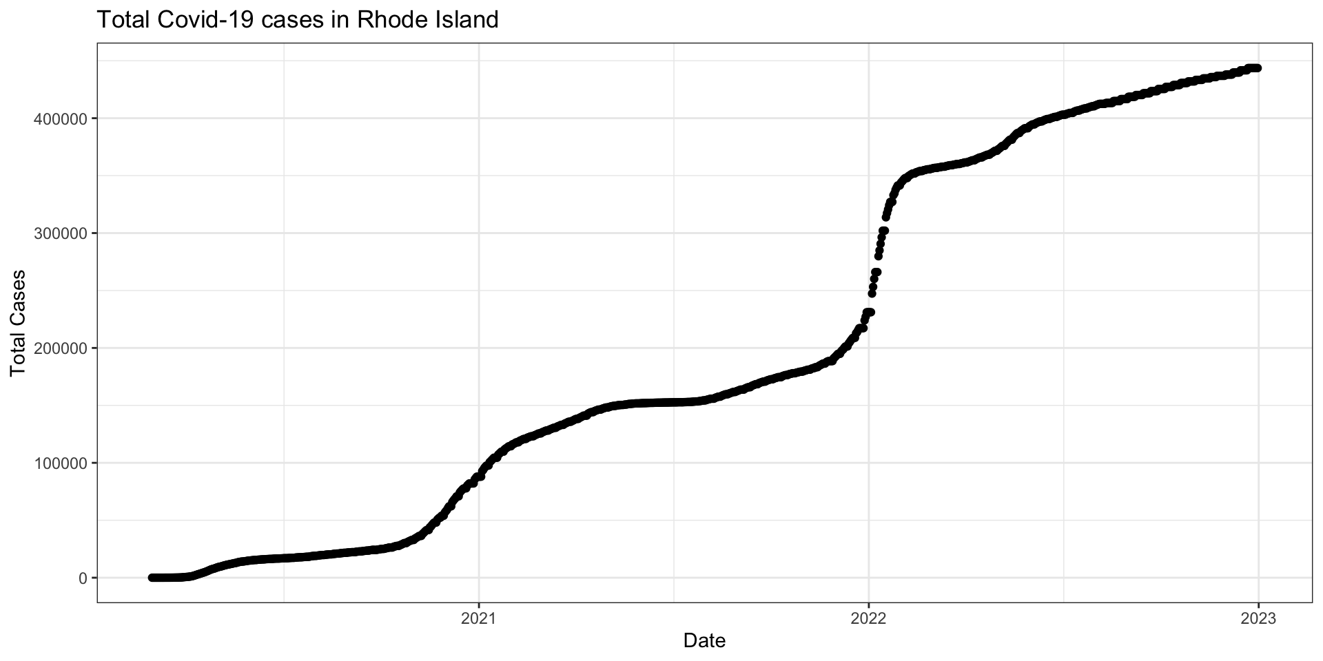
Visualize confirmed variable for Rhode Island
3. Make a basic plot
4.1 Tinker with data
4.2 Tinker with fill aesthetic
4.3 Tinker with coordinates
4.4 Tinker with labels
4.4 Tinker with theme

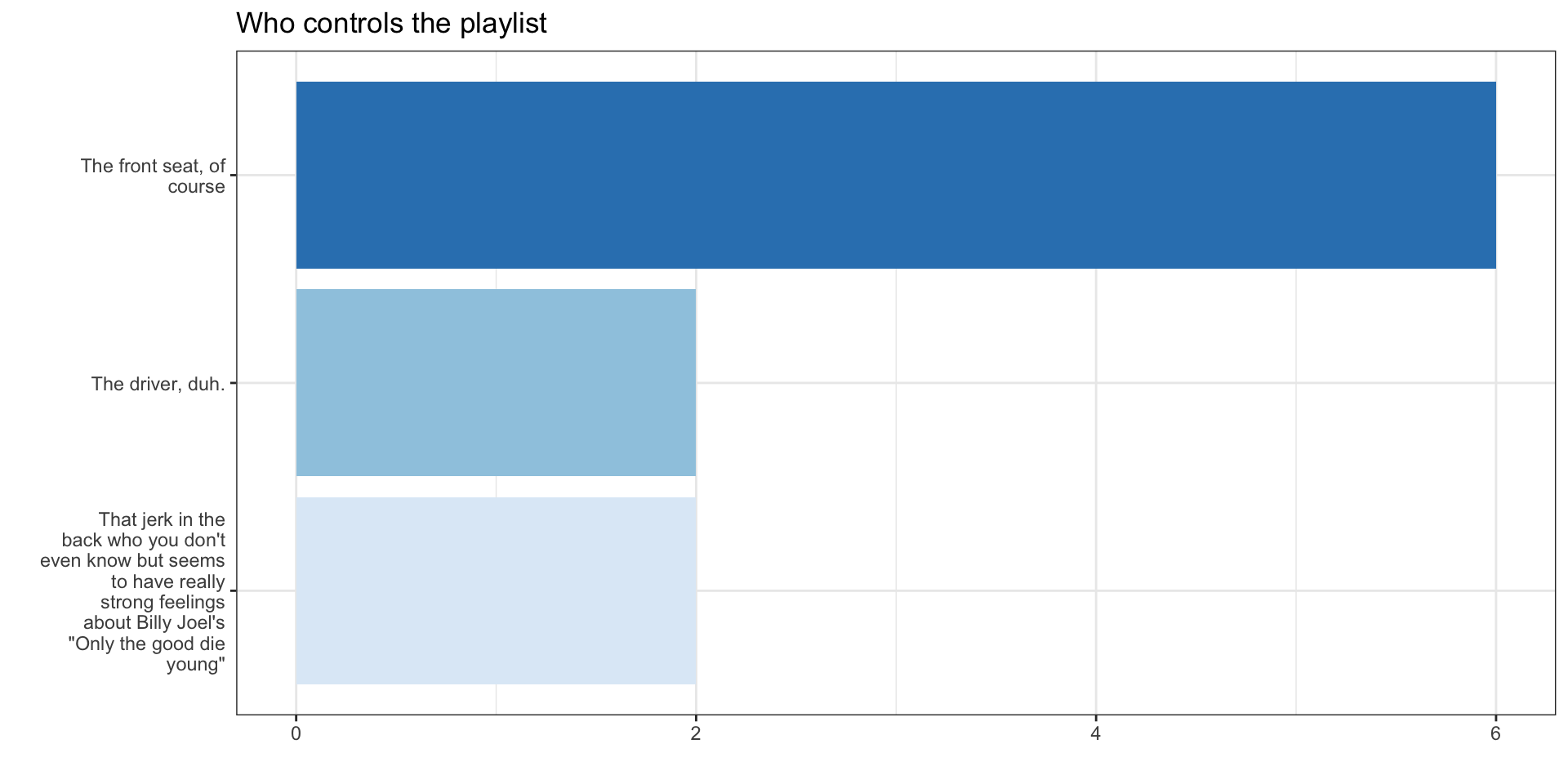
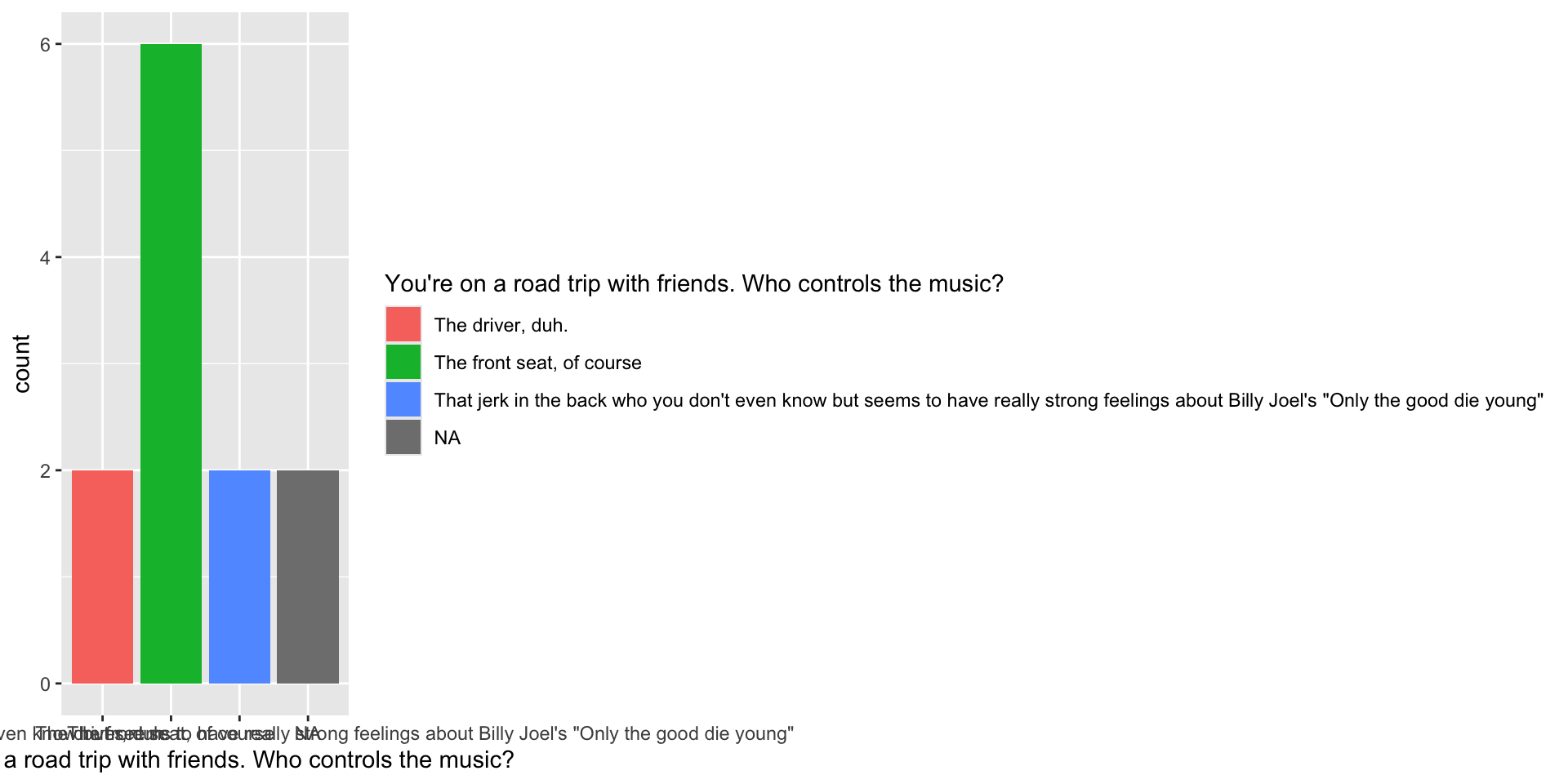
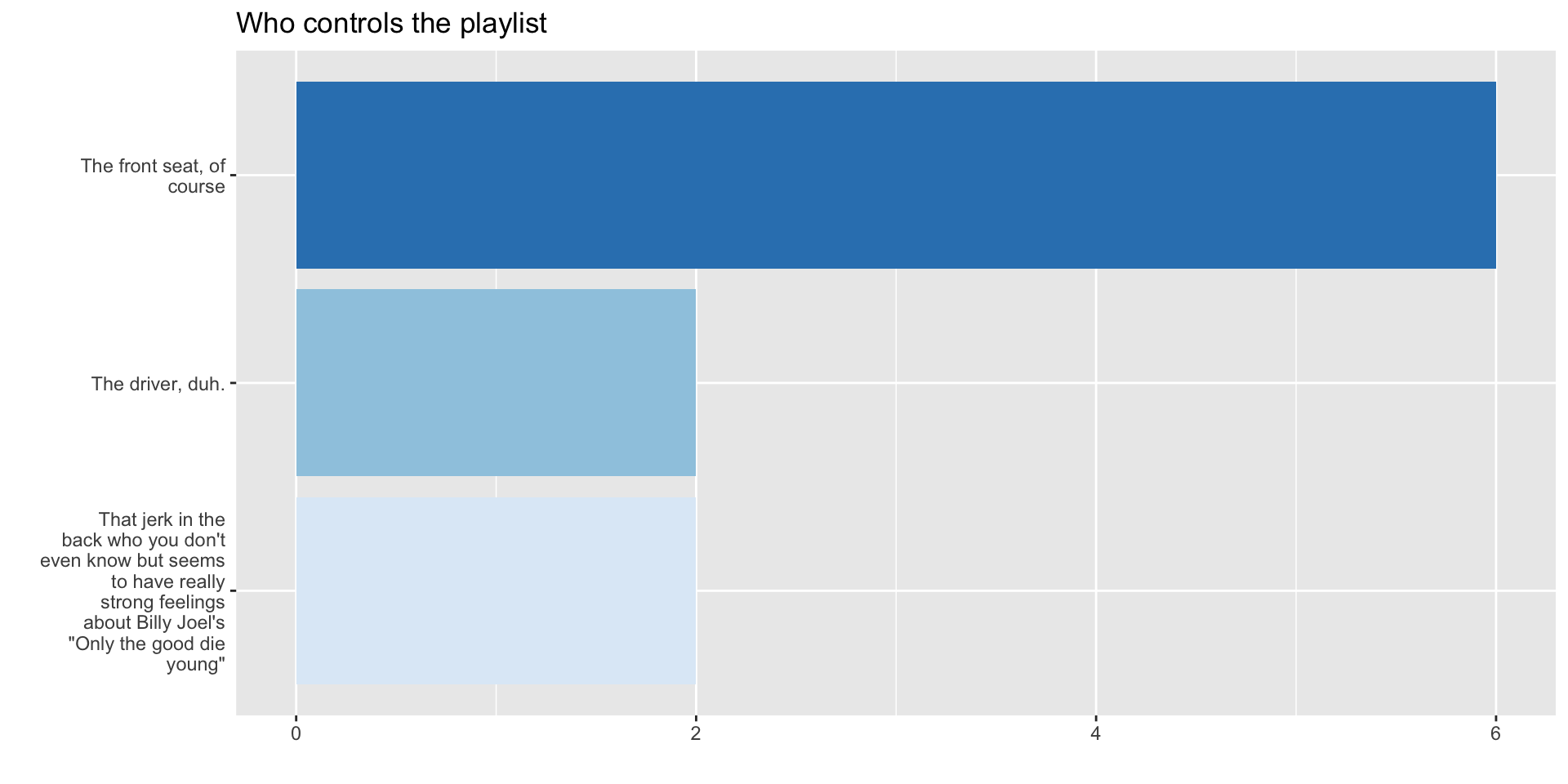
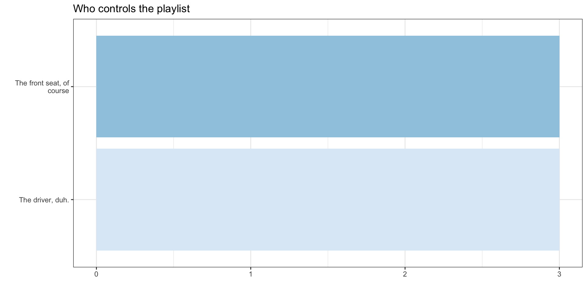
This year’s responses
Barplots
What was the most common face mask policy in the data?
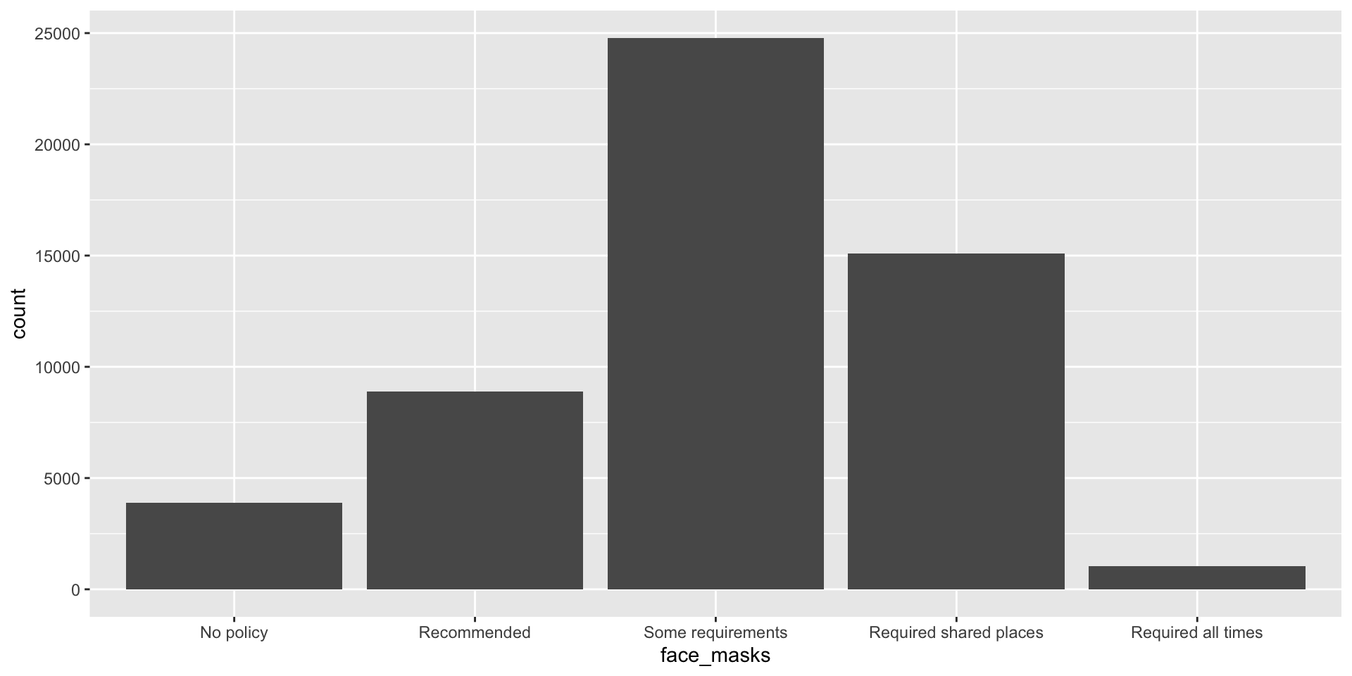
covid_us %>%
  ungroup() %>%
  mutate(
    face_masks = forcats::fct_infreq(face_masks)
  ) %>%
  ggplot(aes(x=face_masks,
             fill = face_masks))+
  geom_bar()+
  geom_text(stat='count', aes(label=..count..),
            hjust=.5,vjust=-.5)+
  guides(fill = "none")+
  theme_bw()+
  labs(
    x = "Face Mask Policy ",
    title = ""
  ) -> fig_barplot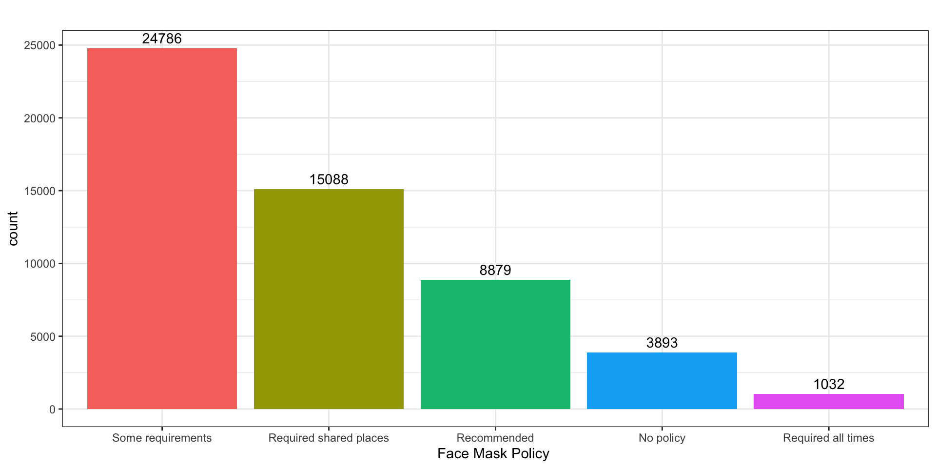
Histogram
What does the distribution of new Covid-19 cases look like in June 2021
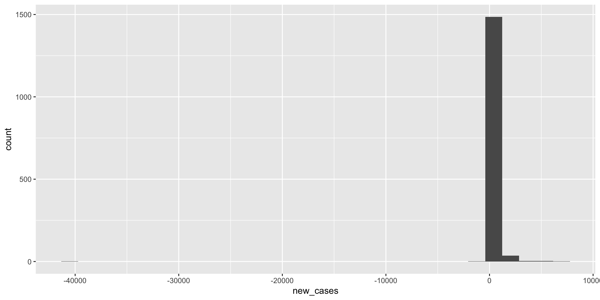
covid_us %>%
  filter(year_month == "2021-06") %>%
  filter(new_cases > 0) %>%
  ggplot(aes(x=new_cases))+
  geom_histogram() +
  labs(
    title = "Exclude Negative Values"
  ) -> fig_hist2a

covid_us %>%
  filter(year_month == "2021-06") %>%
  filter(new_cases > 0) %>%
  ggplot(aes(x=new_cases))+
  geom_histogram() +
  scale_x_log10()+
  labs(
    title = "Exclude Negative Values & Use log scale"
  ) -> fig_hist2b

fig_hist2 <- ggarrange(fig_hist2a, fig_hist2b)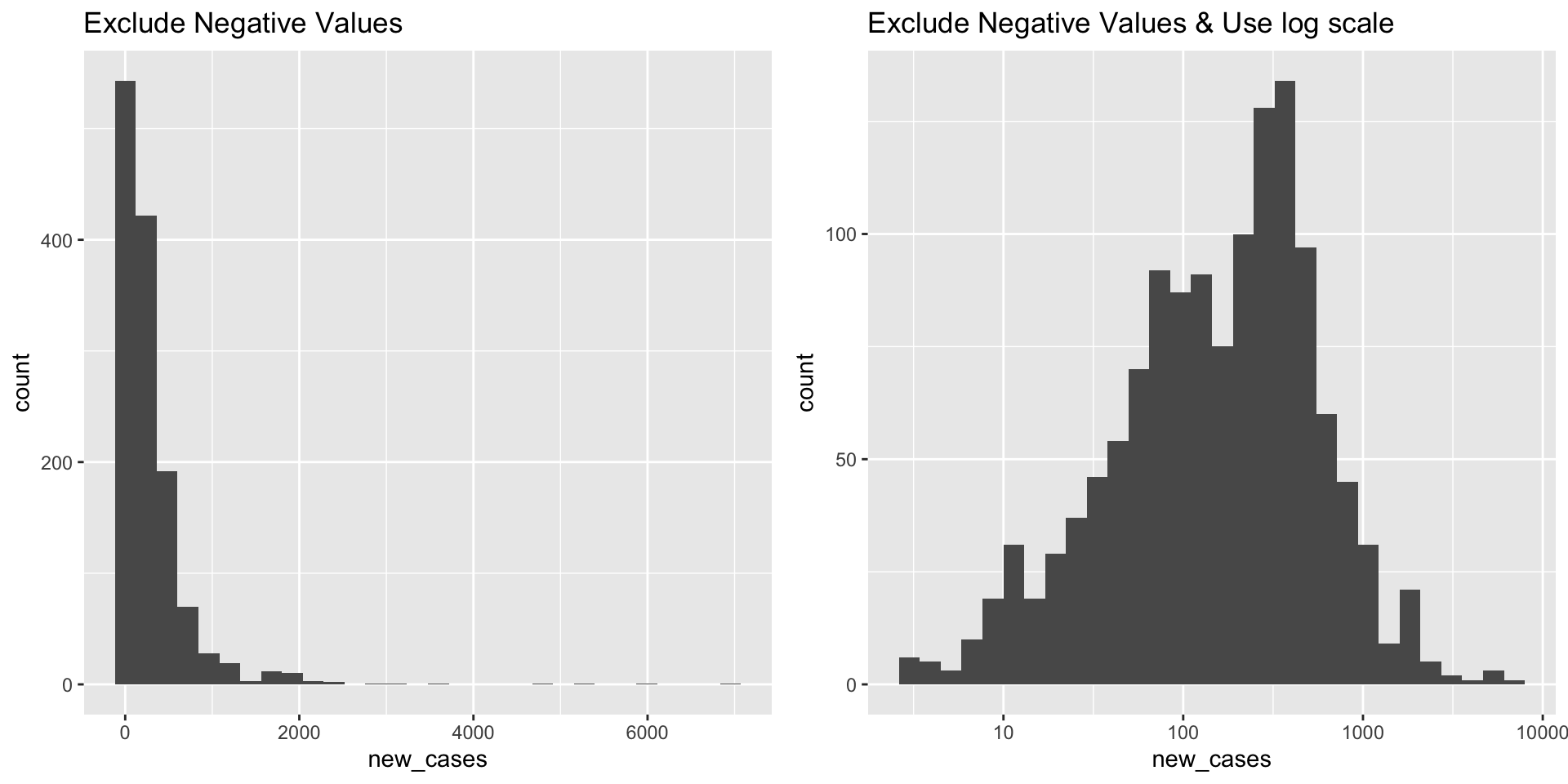
Density Plots
What does the distribution of Covid-19 deaths look like?
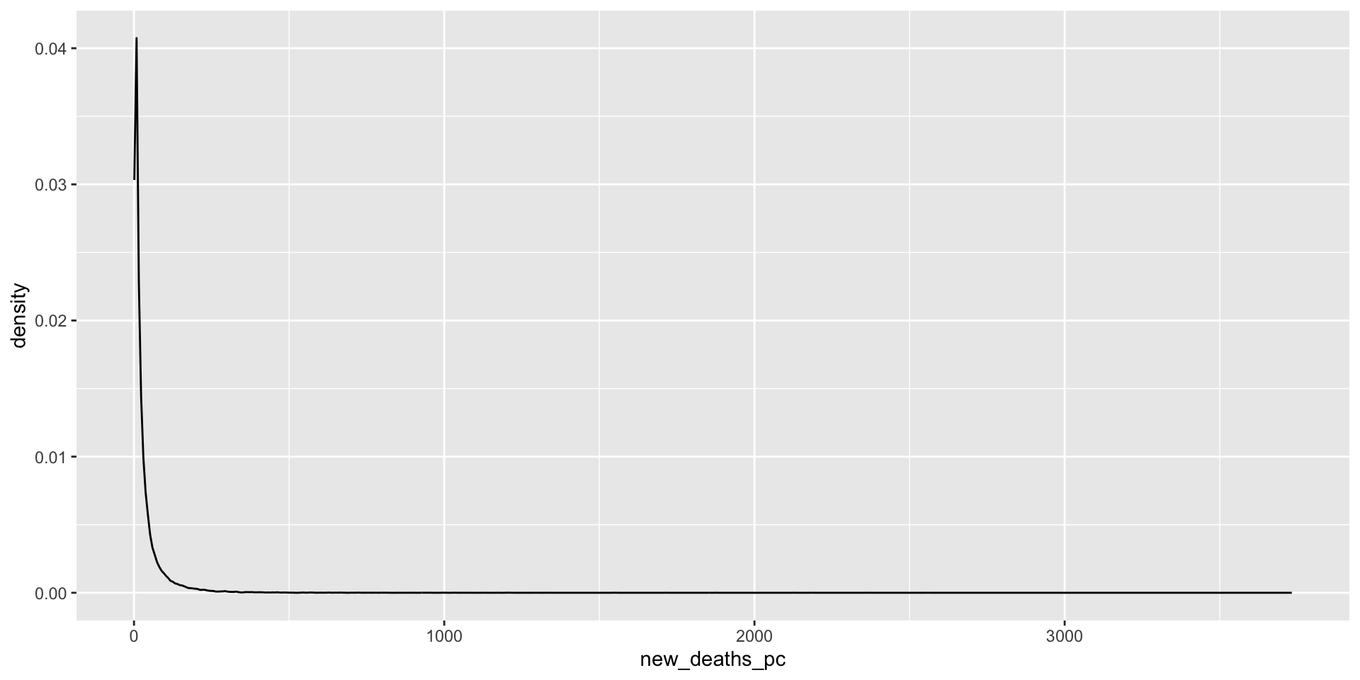
covid_us %>%
  mutate(
    new_deaths = deaths - lag(deaths),
    new_deaths_pc = deaths - lag(deaths),
    year_f = factor(year)
  ) %>%
  filter(new_deaths > 0) %>%
  ggplot(aes(x=new_deaths_pc,
             col = year_f))+
  geom_density() +
  geom_rug() +
  scale_x_log10() +
    facet_wrap(~month)+
  theme(legend.position = "bottom")->
  fig_density2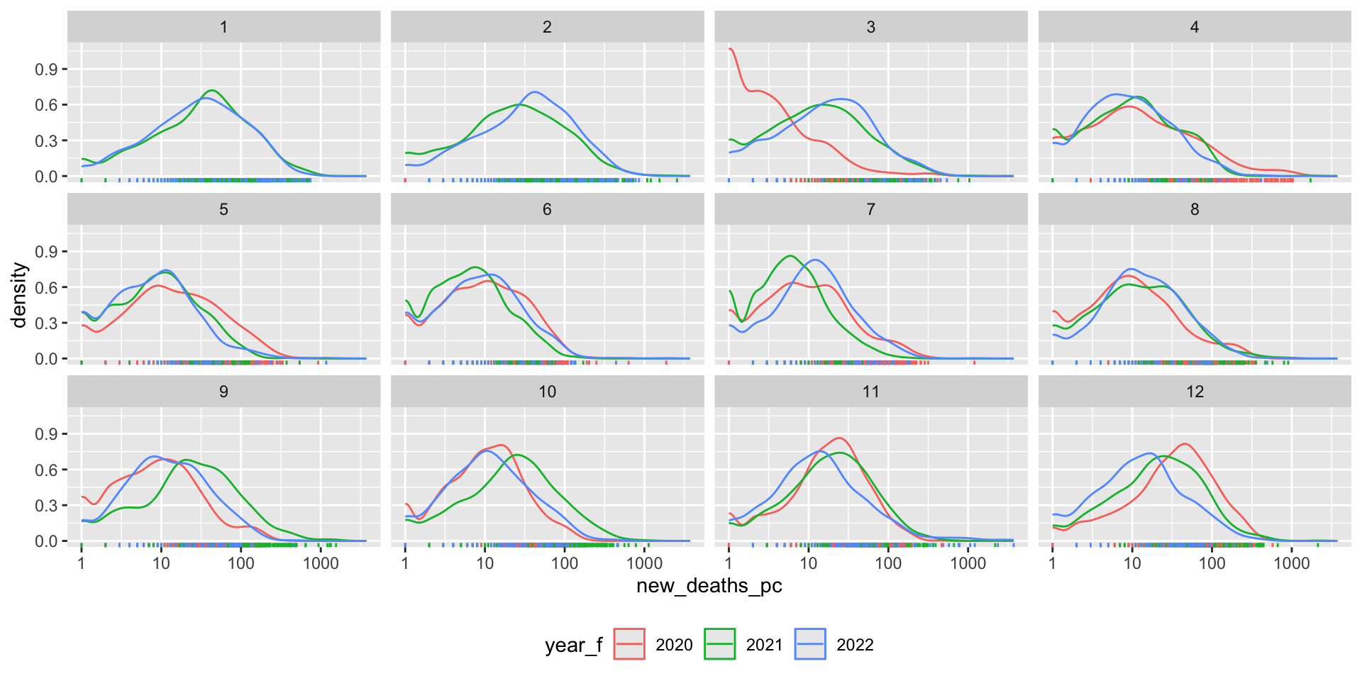
Box plots
How did the distribution of Covid-19 cases vary by face mask policy?
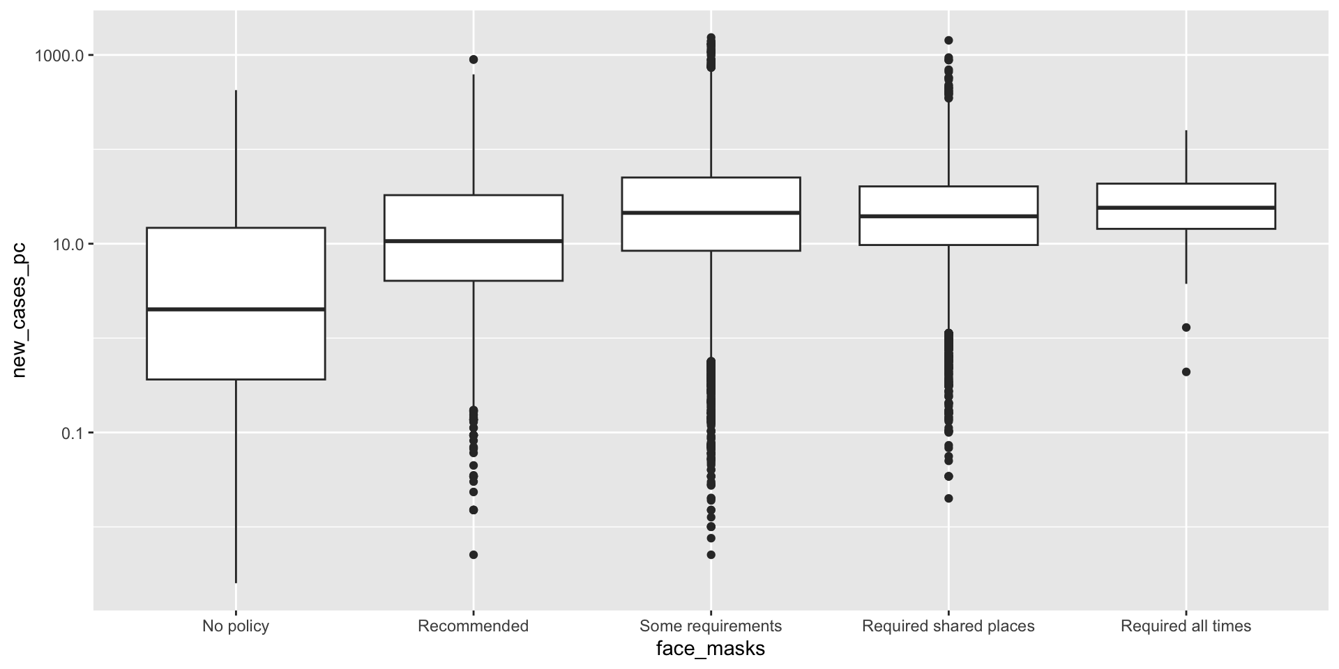
covid_us %>%
  mutate(
    Month = lubridate::month(date, label = T)
  ) %>%
  filter(new_cases_pc > 0) %>%
  filter(year == 2020) %>%
 ggplot(aes(x= face_masks,
            y=new_cases_pc,
            col = face_masks))+
  scale_y_log10()+
  coord_flip() +
  geom_boxplot()  +
    facet_wrap(~Month) +
  theme(
    legend.position = "bottom"
  )-> fig_boxplot2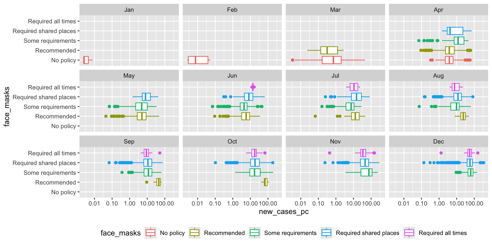
Line graphs
How did vaccination rates vary by state?
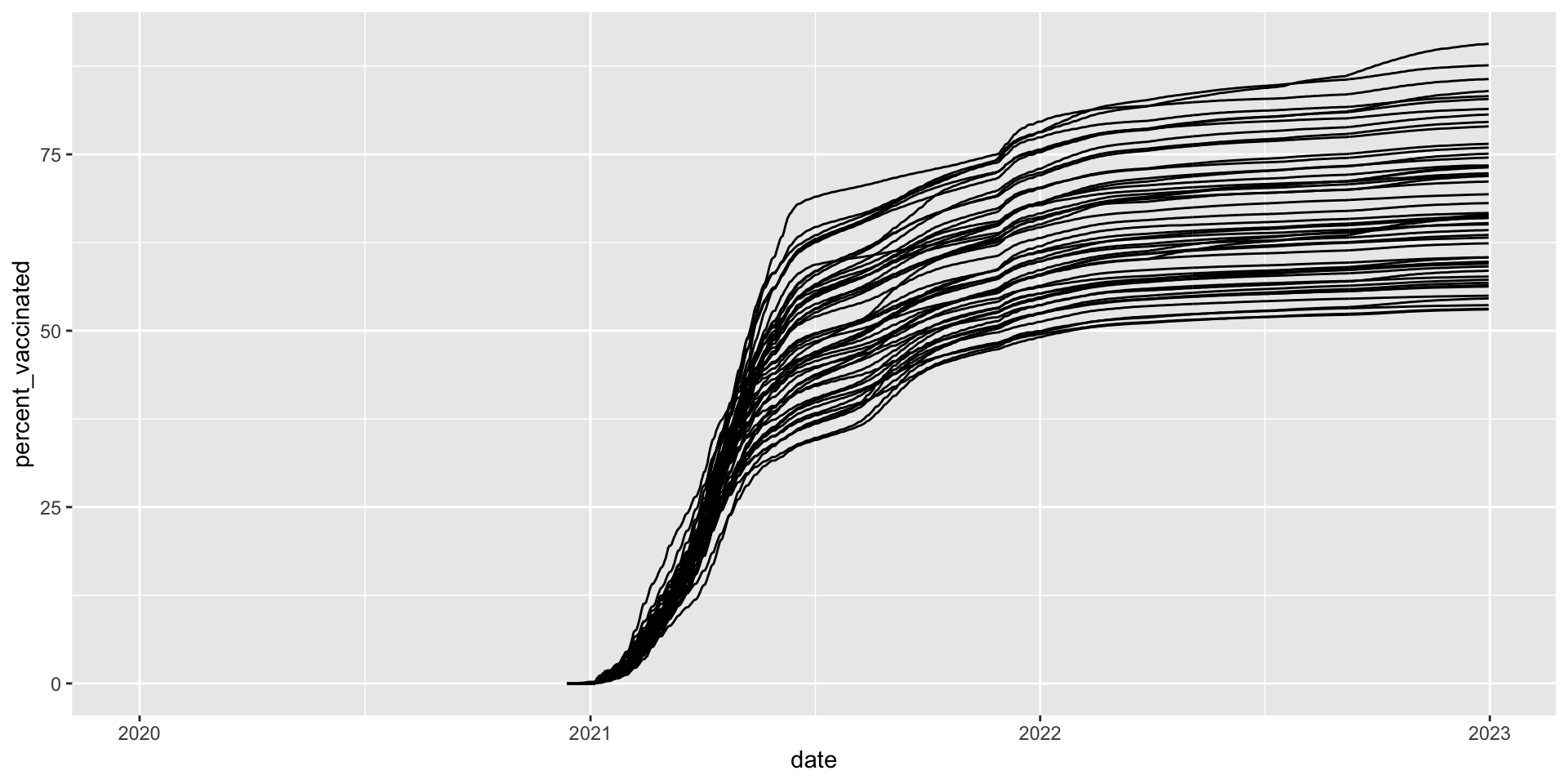
covid_us %>%
  ungroup() %>%
  mutate(
    Label = case_when(
      date == max(date) & percent_vaccinated == max(percent_vaccinated[date == max(date)], na.rm = T) ~ state,
      date == max(date) & percent_vaccinated == median(percent_vaccinated[date == max(date)], na.rm = T) ~ state,
      date == max(date) & percent_vaccinated == min(percent_vaccinated[date == max(date)], na.rm = T) ~ state,
      TRUE ~ NA_character_
    ),
    line_alpha = case_when(
      state %in% c("District of Columbia", "Nebraska", "Wyoming") ~ 1,
      T ~ .3
    ),
    line_col = case_when(
      state %in% c("District of Columbia", "Nebraska", "Wyoming") ~ "black",
      T ~ "grey"
    )
  ) %>%
  ggplot(
    aes(x= date,
        y=percent_vaccinated,
        group = state
        ))+
  geom_line(
    aes(alpha = line_alpha,
        col =line_col)) +
  geom_text_repel(aes(label = Label),
                  direction = "x",
                  nudge_y = 2) +
  guides(
    alpha = "none",
    col = "none"
  )+
  xlim(ym("2021-01"), ym("2023-01")) +
  labs(
    y = "Percent Vacinated",
    x = "Date"
  ) +
  theme_bw()-> fig_line2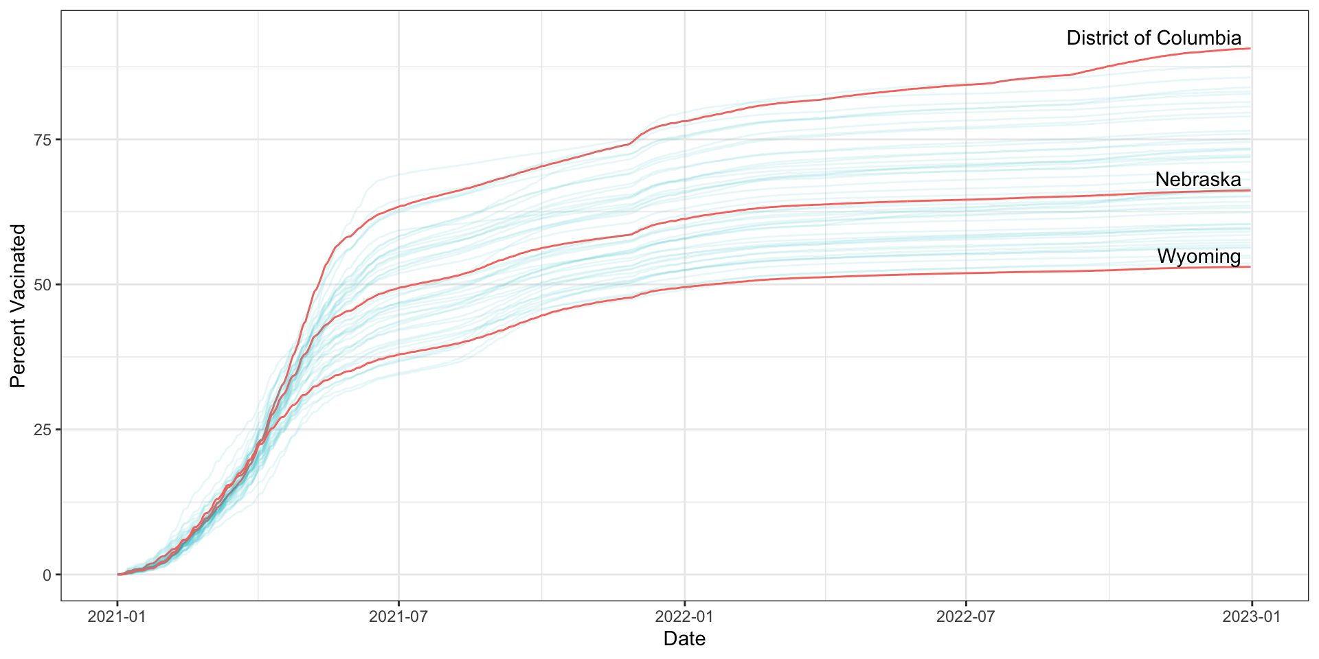
Scatterplots
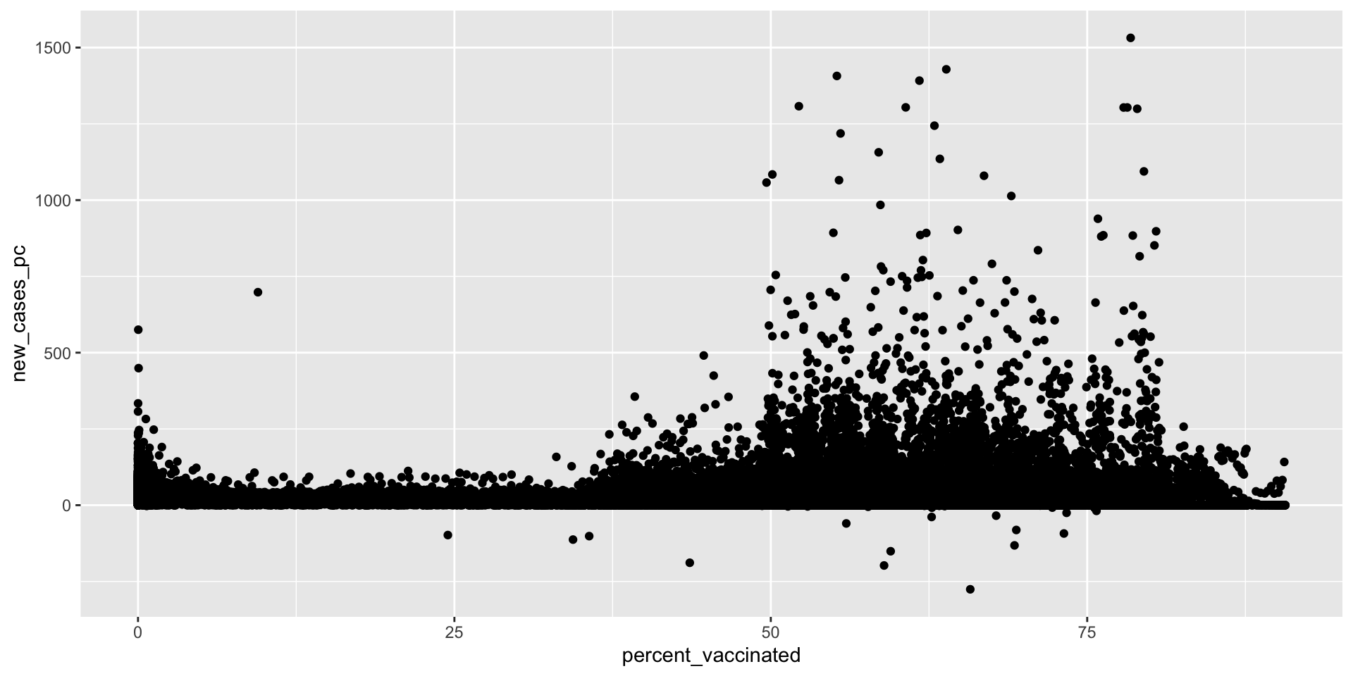
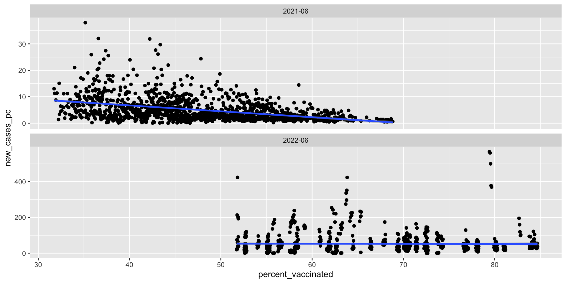
What’s the relationship between vaccination rates and new cases of Covid-19?